Sections
Sections are one of the core concepts of the V4 platform. Designed as a replacement for Content Chunks, Sections can be added to pages and configured in the V4 admin area via a UI instead of by editing YAML data. Sections can contain any code the theme developer adds along with a user defined set of elements and in some sections a flexible number of items.
These are the core section types. Most sections are data-driven, meaning they represent the resource they are intended to render.
- Area Guides
- Articles
- Basic
- Branches
- Custom Form
- Custom Map
- Custom Pages
- Embed
- Image Banner
- Image Carousel
- Image With Text
- Multi Item
- Properties
- Rich Text
- Social
- Staff
- Stamp Duty Calculator
- Tabbed Content
- Testimonials
- Valuation
- Video Banner
Any new section types should be added to all themes to ensure consistency. For this reason it's usually better to create a new variant of an existing section where possible. Once added to a theme, sections are added to configurable pages via the 'Add section' menu in the V4 admin page builder.
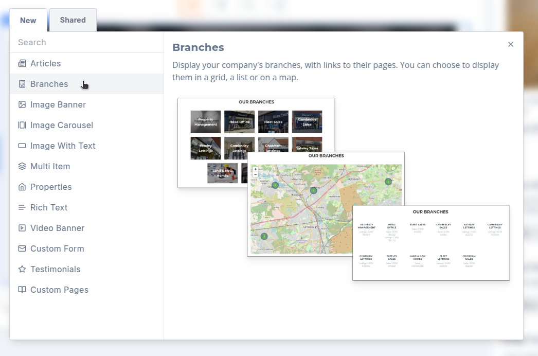
Adding a New Section
Each theme will have its own set of Sections in [domain]/sections/.
In the admin page builder all sections are rendered as client components. This allows us to dynically update them in real-time based on Redux state. For example, when a user changes the text of a heading element we need to update the rendered value of that heading immediately for the user to preview what it will look like on the site. In contrast, sections and elements rendered on the client's actual website are not required to update in real-time based on state changes and instead prioritize server-side rendering for better performance. As such every section should have a server wrapper and a client wrapper which load the data accordingly and pass it on to the main section component.
Section directory
Each section requires 4 files:
<section>.component.tsx<section>.schema.ts<section>.client.tsx<section>.server.tsx
<section>.component.tsx
This is where you will build your new section including markup and any logic specific to the section. The section props should be of type SectionProps or a type which extends SectionProps, which can be imported from in @homeflow/v4-lib/sections. This ensures props required by the section data and sectionConfig are passed to the component.
The markup may also include items and/or elements.
The props in SectionProps include:
sectionthis contains information about the section including it's configuration.sectionItemWrappershould be passed to the Section component from the server wrapper if the section contains items, this is used to enable the admin system to add, remove, edit and reorder items.sectionElementWrappershould be passed to the Section component from the server wrapper if the section includes individual elements, this is used to enable the admin system to add, remove, edit and reorder items.
<section>.schema.ts
A section schema can be thought of as a set of rules and instructions for configuring and rendering a section. It exists as an object with various properties describing any initial state and the settings that should appear in the sidebar when configuring this section in the admin page builder. The schema should be of type SectionSchema, which can be imported from @homeflow/v4-lib/sections. The schema object should be default exported from the schema file then imported into [domain]/sections.client.ts. Here it is added to the sections object with the key being the uppercase name of the section component, eg. RichText.
Eg. sections.client.tsx
const schemas: { [key: string]: SectionSchema } = {
RichText: richTextSchema,
// ...
};
Our convention is to import the default exported schemas as the name of the section component and then add them with shorthand syntax:
Eg.
const schemas: { [key: string]: SectionSchema } = {
Articles,
Branches,
RichText,
// ...
};
In your section schema, the fields icon, caption, previewImage and description set data required for the "Add section" modal. For the previewImage include a screengrab .png image of the section as it will appear inside your section directory, eg [domain]/sections/<new-section>/preview.png. If your section has multiple variants, combine images of the different views into a single .png image so that all variants are visible at a glance to the user.
initialConfig sets placeholder data required by section elements when a section is first added to a page. This also populates the redux state for that section. The initialConfig is of type MixedPageSection, a union type representing the data structures of the available sections.
configSettings configure the section controls that appear on the right hand sidebar in admin when editing a page and should be an array of ConfigSetting, each with a type value of ConfigSettingType which defines the type of input to render (text, select, boolean etc).
There are a number of different control options to suit particular configuration requirements. These controls can be found in app/admin/components/config-control/. The fields you will add to each configSetting object will depend on the type of control you use. For example, if you set type: 'select' you will likely require options.
defaultLayoutConfig and variantDefaultLayoutConfig define the default layouts used by the CMS for elements within sections and items.
When a theme requires elements to default to a layout that differs from the global default layout, a defaultLayoutConfig and/or variantDefaultLayoutConfig should be defined in the CMS schema. A matching configuration must also be passed to the ContainedSectionElements control on the site.
Our convention is to define all theme layout defaults in a single default-layout-configs.ts file within the sections directory. These configs are then imported and used consistently across both the schema and the ContainedSectionElements controls. This ensures defaults remain in sync and makes it easy to see the standard layout options supported by the theme.
Different defaults can be specified for elements that appear within a section versus within items, and individual variants can define their own layout configurations as required.
Eg.
defaultLayoutConfig: {
elements: defaultLayoutConfigLargeGap
}
variantDefaultLayoutConfig: {
circles: { itemElements: defaultLayoutConfigSmallGap },
},
<section>.client.tsx
This client wrapper retrieves the necessary data from the Redux-based state and supplies it to the target component.
If the data can be modified by the user via the side panel, consider implementing debouncing to prevent excessive loading operations. Additionally, depending on the nature of the data, memoizing the component may help optimize performance and prevent unnecessary re-renders when editing other sections in admin.
E.g. use of both debouncing and memoization
'use client';
import SectionElementWrapper from '@homeflow/v4-lib/components/sections/section-elements/section-element-wrapper.component';
import SectionItemWrapper from '@homeflow/v4-lib/components/sections/items/section-item-wrapper.component';
function DataClient(props: SectionWrapperProps<GenericConfig>) {
const count = props.section.configuration.count;
const [data, setData] = useState<SerializableData[]>([]);
const debouncedFetchData = useCallback(
debounce((count) => {
async function loadData() {
try {
const res = await fetch(`/api/data?params=${JSON.stringify({ pageSize: count || 12 })}`);
const { results } = await res.json();
setData(results);
} catch (e) {
console.error(e);
toast.error('Error loading data.');
}
}
loadData();
}, 1000),
[]
);
useEffect(() => {
debouncedFetchData(count);
}, [count]);
return (
<ClientSection {...props}>
{(pageSectionProps: PageSectionProps) => (
<DataSection
section={pageSectionProps.section}
data={data}
editMode={props.editMode}
SectionElementWrapper={SectionElementWrapper}
SectionItemWrapper={SectionItemWrapper}
/>
)}
</ClientSection>
);
}
export default memo(DataClient);
Client wrappers should accept props of type SectionWrapperProps which can be imported from @homeflow/v4-lib/sections. This type takes in a generic type which should represent the data requirements of your section. Most sections will fit the GenericConfig type found in lib/state/config/page-config.types.ts. Other types that extend from GenericConfig can be found in the same file. However, if your new section requires data that is not available on any of the provided types, a new type can be added to page-config.types.ts which should then be added to the union type MixedPageSection.
<section>.server.tsx
As with the client wrapper, the server wrapper collects the relevant data but doesn't need to debounce or use redux state and passes this data on to the main component. Below is an equivalanet example to the client wrapper above.
E.g.
async function DataServerInner(props: SectionWrapperProps<GenericConfig>) {
const {
section: { configuration },
} = props;
const { results } = await Data.findAll({
pageSize: configuration.count || 12,
});
let data: Data[] = results;
return (
<ServerSection {...props}>
{(pageSectionProps: PageSectionProps) => (
<DataSection section={pageSectionProps.section} daa={data} />
)}
</ServerSection>
);
}
export default async function DataServer(props: SectionWrapperProps<GenericConfig>) {
return (
<Suspense fallback={<DataSkeleton />}>
<DataServerInner {...props} />
</Suspense>
);
}
<section>.server.tsx should be imported into [domain]/sections/sections.server.tsx and added to the sections object with the key being the uppercase name of the section component.
Our convention is to import the server wrapper as the name of the section component and then add them with shorthand syntax:
Eg.
import Data from './data/data.server';
// ...
const sections = {
// ...
Data,
// ...
};
This sections object is then used to render the available sections on the site via the @homeflow/v4-lib/theme/sections/section-wrappers/server-section.
As with client wrappers the props for server wrappers should be of type SectionWrapperProps. This type takes in a generic type which should represent the data requirements of your section. Most sections will fit the GenericConfig type imported from @homeflow/v4-lib/state. Other types that extend from GenericConfig can be found in the same place. However, if your new section requires data that is not available on any of the provided types, a new type can be added to page-config.types.ts which should then be added to the union type MixedPageSection.
Items
Items are repeatable, structured blocks, defined by the theme developer, used to organize content within a section. They are used to represent reusable layouts or templates (e.g., cards, testimonials, feature blocks).
For the admin system to be able to add, remove, edit and reorder items they need to be wrapped in a SectionItemWrapper. SectionItemWrapper components are not passed in server side components, so it's presence needs to be checked before using it.
E.g.
{section.configuration.items && section.configuration.items.map((item, boxIndex: number) => {
return (
<Fragment key={item.id}>
{SectionItemWrapper ? (
<SectionItemWrapper
item={item}
itemIdChain={[item.id]}
section={section}
sectionConfig={section.configuration}
defaultInitialItem={initialMultiItem()}
>
<ItemComponent
item={item}
section={section}
editMode={editMode}
/>
</SectionItemWrapper>
) : (
<ItemComponent
item={item}
section={section}
/>
)}
</Fragment>
);
})}
Note editMode does not need to be passed if there is no SectionItemWrapper as this means it's a server component and not editable.
Items will generally be a component that contain items and/or elements.
Additional notes:
- In a similar way to sections, items support
configSettings, which control their appearance (e.g., background images, colours, spacing). - Each item has a unique
itemIdChain, an array of IDs starting from its oldest ancestor and ending with its own ID. This allows precise identification of an item's position in the hierarchy, some of the wrappers need the itemIdChain to be passed in. When items are nested the itemIdChain prop will need updating to something likeitemIdChain={[...parentItemIdChain, item.id]}.
Elements
Elements are the smallest content units that users can add directly in the UI. They represent individual visual or interactive components such as:
- Headings
- Text blocks
- Images
- Links
- Buttons
Elements define content within sections, items and other elements.
See the Elements doc for what each element type is and for details on specific types such as the Form element. The rest of this section covers the components used to render and lay out elements within a section.
There are a few components that can be used to display elements:
| Component | Description | When to Use |
|---|---|---|
ContainedSectionElements |
A standalone component that creates a block of elements displayed in a flex layout. The CMS allows users to edit the flex properties of these elements. | For simple, self-contained layouts controlled entirely by the CMS |
SectionElementContainer |
Wraps a block of elements and allows the CMS to control the flex layout. | When combining elements with other custom content within the same layout |
SectionElements |
Displays an array of elements. | When displaying an array of elements |
SectionElement |
Displays a single element. | When displaying a single element |
ContainedSectionElements displays a block of elements within a single component. If you need more flexibility for example to insert other content between elements or display individual elements separately then use SectionElementContainer together with SectionElements or SectionElement.
E.g. Elements in a section
<ContainedSectionElements
defaultFlexConfig={defaultLayoutConfigSmallGap}
editMode={editMode}
SectionElement={SectionElement}
section={section}
baseClassName="**theme-name**-**section-area-identifier**" // e.g. rigel-multi-item-boxes
SectionElementWrapper={SectionElementWrapper}
globalConfig={globalConfig}
/>
defaultFlexConfig defines the default layout for contained elements, if different from the V4 defaults. It has a type of ResponsiveFlexConfig. If this is provided, it must also be defined in the schema file.
Our convention is to define all theme layout defaults in a single default-layout-configs.ts file within the sections directory. These configs are then imported and used consistently across both the ContainedSectionElements controls and the schema. This ensures defaults remain in sync and makes it easy to see the standard layout options supported by the theme.
Eg.
export const defaultLayoutConfigSmallGap = { mobile: { gap: '3' }, desktop: { gap: '3' } };
export const defaultLayoutConfigMediumGap = { mobile: { gap: '5' }, desktop: { gap: '5' } };
export const defaultLayoutConfigLargeGap = { mobile: { gap: '8' }, desktop: { gap: '8' } };
E.g. Elements in an item
<ContainedSectionElements
defaultFlexConfig={defaultLayoutConfigMediumGap}
className="uppercase font-bold text-sm"
editMode={editMode}
SectionElement={SectionElement}
section={section}
baseClassName="**theme-name**-**section-area-identifier**" // e.g. rigel-multi-item-boxes
SectionElementWrapper={SectionElementWrapper}
itemIdChain={[item.id]}
globalConfig={globalConfig}
/>
If this was to be used for an item nested within another item then you will need to update the itemIdChain accordingly e.g. itemIdChain={[parentItem.id, item.id]}.
E.g. Elements with other content appearing in the flex layout
<SectionElementContainer
defaultFlexConfig={defaultLayoutConfigLargeGap}
flexConfig={section.configuration.flex}
>
<SectionElements
elements={section.configuration.elements}
SectionElement={SectionElement}
section={section}
baseClassName="**theme-name**-**section-area-identifier**" // e.g. rigel-multi-item-boxes
SectionElementWrapper={SectionElementWrapper}
editMode={editMode}
globalConfig={globalConfig}
/>
<div className="mt-4">Other content treated as another element within the layout flow</div>
</SectionElementContainer>
E.g. Moving an element out of the area and displaying it separately
let firstElement;
if (section.configuration.elements.length > 0) {
firstElement = section.configuration.elements[0];
}
let otherElements;
if (section.configuration.elements.length > 1) {
otherElements = section.configuration.elements.slice(1);
}
return (
<div>
{firstElement && (
<SectionElement
key={firstElement.id}
element={firstElement}
elementIdChain={[firstElement.id]}
section={section}
baseClassName="gar-image-banner-cta"
editMode={editMode}
globalConfig={globalConfig}
SectionElementWrapper={SectionElementWrapper}
/>
)}
<div>Section/item specific code</div>
<SectionElementContainer
defaultFlexClassName="justify-between @md:justify-between"
flexConfig={section.configuration.flex}
>
{otherElements &&
otherElements.map((element) => (
<SectionElement
key={element.id}
element={element}
elementIdChain={[element.id]}
section={section}
baseClassName="gar-image-banner-cta"
editMode={editMode}
globalConfig={globalConfig}
SectionElementWrapper={SectionElementWrapper}
/>
))}
</SectionElementContainer>
</div>
);
The SectionElement used above is the theme's own render component. It is a switch on element.type that maps each element type to its markup, and is defined within the theme (a basic version is included in the boilerplate theme as a starting point). This is distinct from the SectionElement type exported from @homeflow/v4-lib/state, which describes the element data structure.
Variants
A 'variant' is a section sub-type that typically shares similar data requirements as other variants of the section, but renders the data in a different layout. For example, the 'Properties' section might have variants for 'Slider' and 'Map'. Both of these sections require the same property data but it is rendered on a slider/carousel or a Leaflet map respectively.
Unlike section types, variants can be theme-specific. If a client moves to a theme that does not support a specific variant, the theme will still be able to render the section by falling back to the default variant.
Variants can be added to a section schema like any other config setting, using the field name 'variant'.
The variant field should always be of type ConfigSettingType.Select for consistency.
For example, you might create a couple of alternative layouts for the ImageBanner section:
configSettings: [
{
label: 'Variant',
type: ConfigSettingType.Select,
options: [
{
value: 'hero',
label: 'Hero',
},
{
value: 'callToAction',
label: 'Call to Action',
},
],
field: 'variant',
},
];
You can then conditionally render the correct variant based on the value inside the section component:
if (props.section.configuration.variant === 'callToAction') {
return <ImageBannerCallToAction {...props} />;
}
return <ImageBannerHero {...props} />;
We recommend using camelCase string values for variant names as it makes it easier when accessing variant settings later, e.g. variantSettings?.myVariant vs variantSettings?.['my-variant']
Variant Settings
Variants also allow settings to be added that are specific to that variant. These settings are stored and accessed separately from top-level settings so they are more isolated and provide a reduced risk of unexpected side effects from name clashes. They are therefore well suited to theme-specific config settings for sections.
In general, any theme-specific section settings should be added as variant settings and not as top-level ones.
To add variant settings, add a variantSettings object to the schema:
variantSettings: {
// important - the key here must match the value of the variant name exactly
callToAction: {
label: 'CTA Position',
description:
"Where to place the main text content",
type: ConfigSettingType.MultiOption,
defaultValue: 'left',
field: 'ctaPosition',
options: [
{ label: 'Left', value: 'left' },
{ label: 'Centre', value: 'center' },
{ label: 'Right', value: 'right' },
],
},
}
Although variant settings are stored in a nested structure scoped to the variant name in the section data, when the variant is rendered they are automatically moved to the top-level configuration, therefore you can access them as you would a normal settings on section.configuration. For example:
section.configuration.ctaPosition;
Be careful to ensure the spelling of the variant name key is correct (callToAction in the example above) as we use a loose any type here. You should always use optional chaining (via ?) for variant settings.
You must extend the config type in the section components to ensure proper typing. Examples:
ImageBannerConfig & { ctaPosition: string; };
ImageWithTextConfig & { overlayOpacity: string; };
GenericConfig & { showCta: boolean; };
Previously, variant settings were stored alongside other settings. While this approach is now deprecated and should no longer be used, some sections in existing themes support this as a fallback for backward-compatibility.
Variant Initial Config
initialConfig only runs once, when a section is first added to a page. It cannot account for variants, because the user picks a variant after the section already exists.
When a variant needs substantially different default content (different elements, channel, count etc) to the one produced by initialConfig, add a variantInitialConfig entry for it. Each entry is a function, keyed by variant name, that returns the defaults for that variant.
variantInitialConfig: {
// the key must match the variant name exactly
feefo: () => ({
elements: [
{ id: uuid(), type: ElementType.Heading, html: 'Customer reviews', level: 2 },
],
}),
}
When the user switches to a variant that has a variantInitialConfig entry, the section's configuration is regenerated from that function, overwriting the existing configuration (only the section id and the newly selected variant are preserved). Switching to a variant without an entry leaves the existing configuration untouched and just updates the variant field, as before.
Regeneration only happens on pages owned by the current agency. On shared pages the section belongs to another agency, so switching variant updates the variant field without overwriting the configuration.
Because regeneration overwrites the configuration, any edits the user has made to the section will be discarded when they switch to a variant that has its own defaults. Only add a variantInitialConfig entry for variants whose layout genuinely needs different starting content.
Common controls
As well as the section specific settings you can set up in your schema, there are some common settings that are applied to each page section. These include vertical padding, z-index and an overlap setting, all of which can be found in admin. The ClientSection and ServerSection components wrap your section in a PageSection component that handles the rendering of these settings for you
Customising overlap sizes per theme
The overlap setting (None / Small / Large) pulls its margin values from CSS custom properties rather than hard-coded Tailwind classes. Defaults are defined in the lib's app.global.css:
--overlap-small: 0.5rem;
--overlap-small-md: 1.5rem;
--overlap-large: 1rem;
--overlap-large-md: 3rem;
A theme can override any of these in its own global.css to use theme-specific overlap sizes.